Menu
Gold Sponsors
|
SmokePing
Reading the GraphsGeneralSmokeping is a latency measurement tool. It sends test packets out to the net and measures the amount of time they need to travel from one place to the other and back.For every round of measurement smokeping sends several packets. It then sorts the different round trip times and selects the median, (ie. the middle one). This means when there are 10 time values, value number 5 is selected and drawn. The other values are drawn as successively lighter shades of gray in the background (smoke). Sometimes a test packet is sent out but never returns. This is called packet-loss. The color of the median line changes according to the number of packets lost. All this information together gives an indication of network health. For example, packet loss is something which should not happen at all. It can mean that a device in the middle of the link is overloaded or a router configuration somewhere is wrong. Heavy fluctuation of the RTT (round trip time) values also indicate that the network is overloaded. This shows on the graph as smoke; the more smoke, the more fluctuation. Smokeping is not limited to testing just the roundtrip time of the packets. It can also perform some task at the remote end ("probe"), like download a webpage. This will give a combined 'picture' of webserver availability and network health. The Overview Graph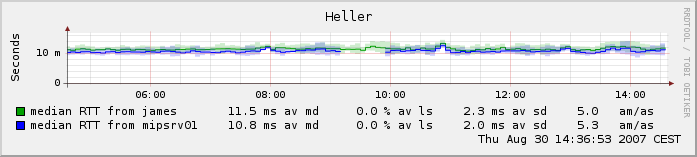 The overview graph shows the curent measurements for a target. If the target is measured from the master as wel as a slave, then
data from both will be shown. In multihost mode, data from all the hosts is shown. The following numbers are present for each line:
The Detail Graph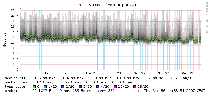 The detail graph provides a large amount of information for a single
target as seen from a single server. The line color depicts the amount of
losst packets and the dark area around the line shows the amount of
variation between individual probes. If you click on the graph you can zoom
interactively in the navigator mode. The following numbers are present in each graph:
The Multihost Graph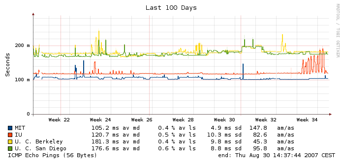 The multihost detail graph is essentially a larger version of the overview graph.
The following numbers are present for each line:
|
|
08/30/2007 | Tobias Oetiker | OETIKER+PARTNER AG
|